

Showing posts with label Space: Edgar Alan Poe. Show all posts
Showing posts with label Space: Edgar Alan Poe. Show all posts
Thursday, 25 November 2010

Final piece 3 in progress


Wednesday, 24 November 2010
Final piece 2 done!- The dungeon

Final Concept 3-Gargoyles in sunset scene


Monday, 22 November 2010
Final Piece 2 in progress( Dungeon)


I think it's a bit too dark and chaotic.... and you can barely see the pit! :/
The dungeon's murals
Using the murals I found on my trip to Chislehurst caves as inspiration I painted the murals of the dungeon with water colours. I wanted to make them look decayed so I didn't emphasise on any details but more on the colours and silhouettes. I am going to adjust them in photoshop to make them look darker.


Sunday, 21 November 2010


Saturday, 20 November 2010
Ink bubbles
 I decided to play around more with ink and I remembered a technique I used back in my foundation course: Ink bubbles popping on paper!
The results were exciting with some very cool ink effects left on the sheet. I am aiming to use these patterns in my finals and hopefully get a good outcome.


 .
....oh yes! Ink can be a very messy buisness! 
Friday, 19 November 2010
1st piece done!

This is really weird! The colours look so much different on a MAC! :o They are much too bright on the pc.. :(
Thursday, 18 November 2010
A Tim Burton touch :)


I drew lines on the mountains and the haunted castle. I'm not sure if it's too much or not so I'd like a bit of feedback on this please :)
Tim Burton Inspiration


Ink blown with a straw


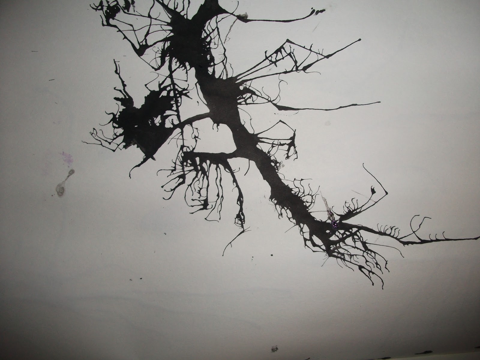


OH! ....and I now have a huge ink stain on my carpet! NOOOOOO!!

Monday, 15 November 2010


Saturday, 13 November 2010
Playing around with colours

Difference

Difference with purple colour.

Normal

I love the effect of the first one! It brings out a gloomy atmosphere but I am not sure if it's allowed to use negative colours in this unit..
Thursday, 11 November 2010

Wednesday, 10 November 2010
thumbnails 10

Ink experimentation
I played around with black and purple ink to get a nice effect for the sky in the castle haunted house scene. The left ones are the patterns of the original ones the wet ink created. I could somehow combine all these into one single layer.


Subscribe to:
Posts (Atom)